User Toolbar
The user toolbar allows operations that are used regularly to be placed on a toolbar for easy access.
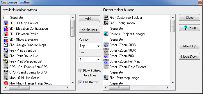
Configuration
Available toolbar buttons - The list of Buttons which can be added to the toolbar.
Current toolbar buttons - The list of Buttons currently selected to appear on the toolbar.
Separator - This is a special button to place a line between a set of buttons. Many separators can be added to the toolbar.
Add -> - Adds the Button to the current toolbar list.
<- Remove - Removes the Button from the current toolbar list.
Close - Closes the window and creates the toolbar.
Move Up - Moves the selected button description up in the list. The list is the order the buttons will appear on the toolbar. Use the up/down buttons to position the buttons in the order you require.
Move Down - Moves the selected button description down in the list.
Position - The position of the toolbar on the OziExplorer window.
Size - The size of the buttons.
Flow Buttons to 2 lines - If the number of Buttons cannot fit on 1 line a second line will be created. If the Buttons cannot fit on 2 lines then the remaining buttons will not be displayed.
Flat Buttons - The buttons will display as just the symbol, taking on a button appearance when the cursor is placed on them.